Characters of colours
Of canvasses and contrasts.
On a canvas, in our home and even in our tea cup - wherever we go, we are surrounded by colours. But that's not all: colours evoke memories and create associations, they influence our perceptions and our emotions - and they create expectations of a certain taste. A little insight into the world of colours.
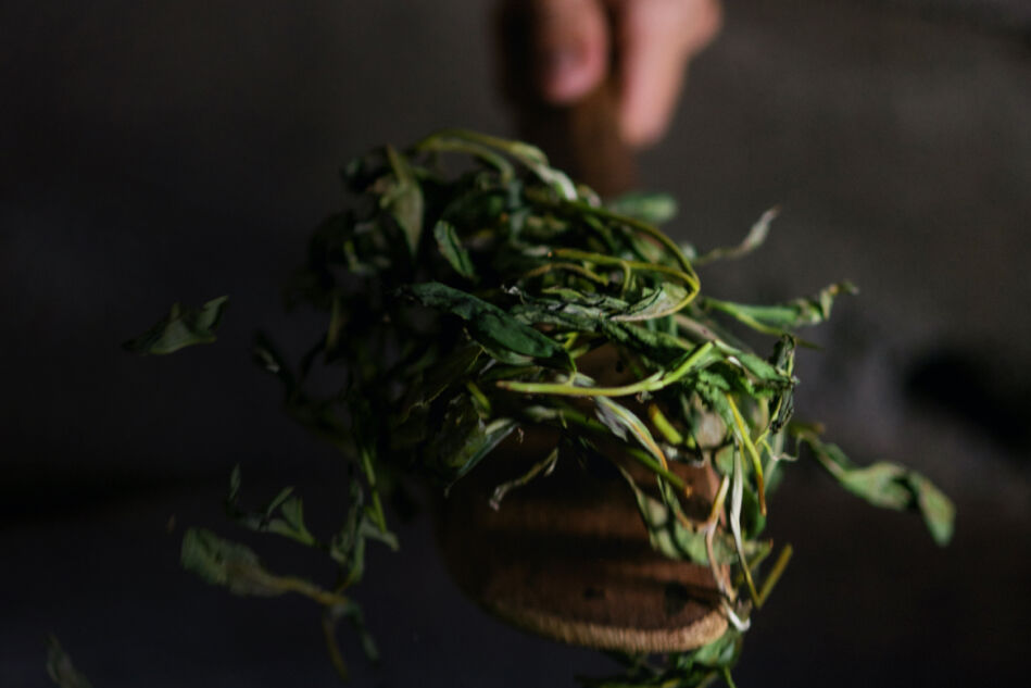
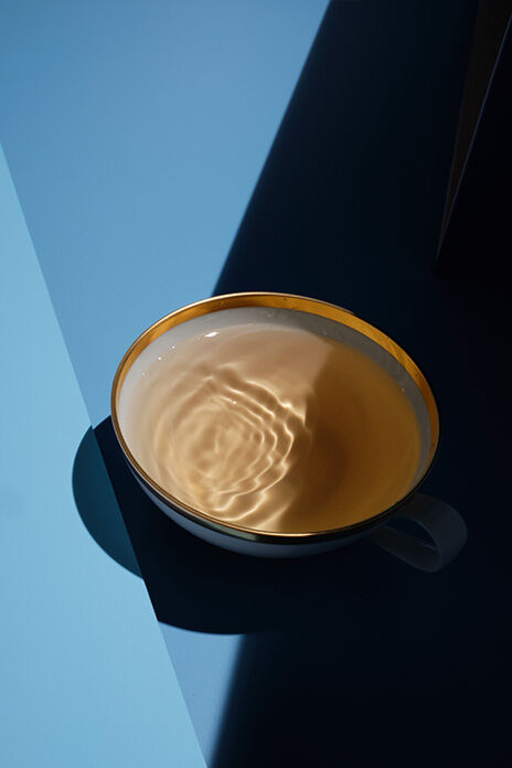
Intense green herbal infusions, a strong black Assam, sensual cream-colored oolong teas - you will find all the facets of an awe-inspiring range of colours in your tea cup. Tea is colourful - and not by chance. “The eye perceives the colour of the tea as a visual stimulus, which is processed in the brain. Colour thus creates expectations of a specific taste - but itis also there to warn us when we shouldn´t eat something. A simple example is unripe fruit or vegetables.”
The colourful world of tea.
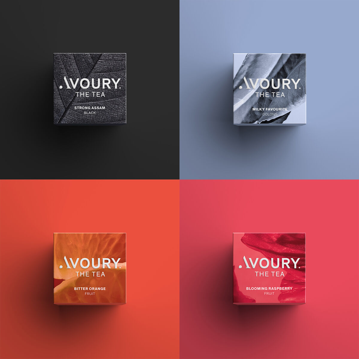
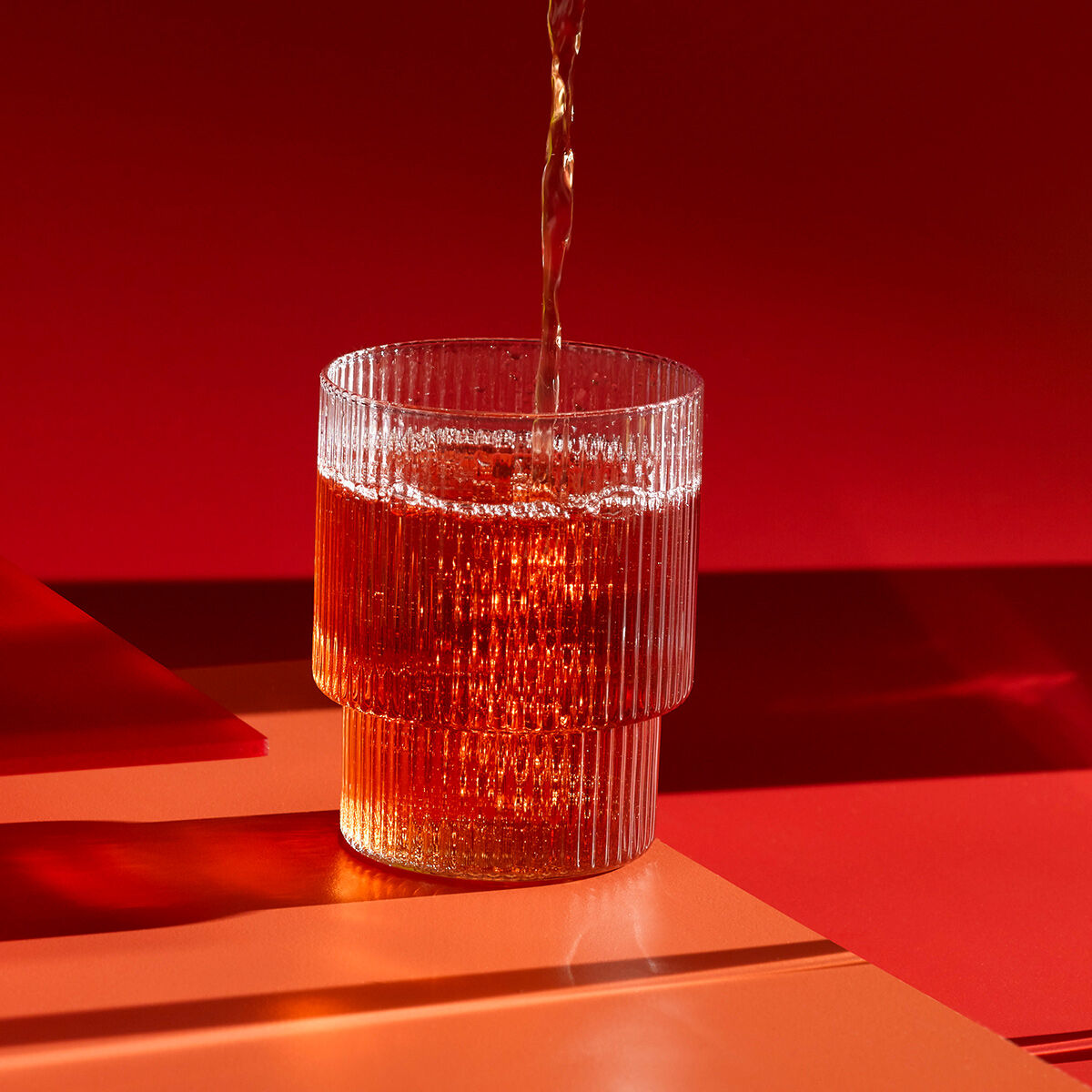
The colour of a tea is determined by the way it is produced: black tea is oxidised so that the tea leaves get their strong, dark hue. They are first rolled in a rolling machine to break open the walls of their cells. Oxygen gets into the small cracks and combines with the cell sap of the leaves. This causes the tea to oxidise - and the precious leaves to turn black. Green tea, on the other hand, should look as if it’s just been picked. That is why tea farmers don’t break the leaves - they are merely dried and heated. But tea is full of surprises: Avoury's GRAND GRANATE guarantees an unimagined interplay of colours. In this green tea, a hint of beetroot turns the colour of the tea in the cup as ruby red as pomegranate seeds. And its taste is also reminiscent of the fruity-sweet seeds. This combination amazes not only tea enthusiasts, but also people who are particularly attuned to visual stimuli.
Spaces that show their colours.
GRAND GRANATE is a master of transformation. This tea plays with the identity of colour. You can also experiment with the characters of different colours in your own livingroom: the use of colour is a particularly popular in interior decorating. When used correctly, colour reflects not only trends but also the facets of our personality. If you want to create visual accents in your home, find inspiration in the wisdom of art to get the most out of colours. The Swiss Bauhaus pioneer Johannes Itten not only used shapes to express the interplay between colours, he also came up with seven colour contrasts.
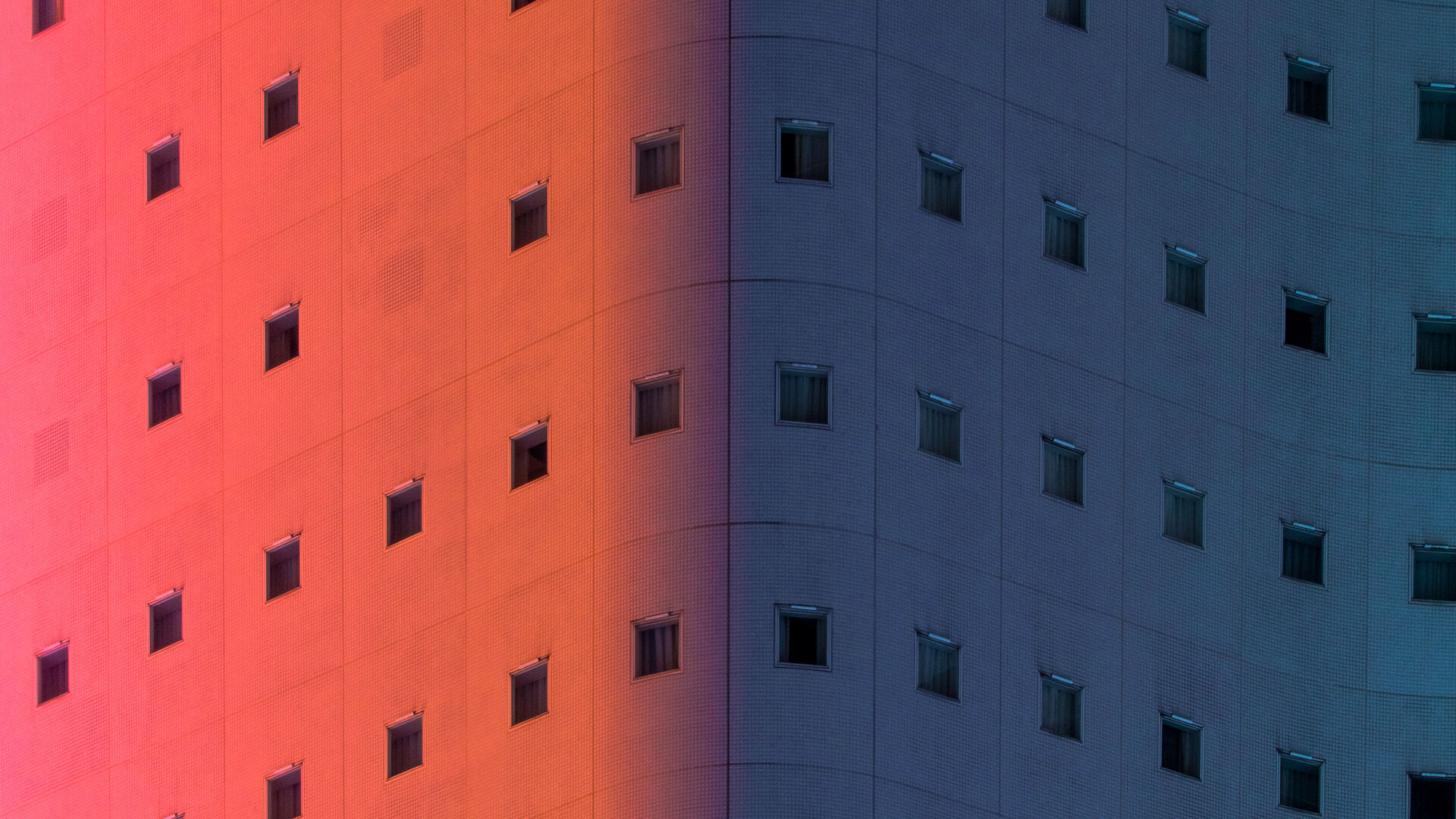
One of these is the cold-warm contrast, which is created by combining warm tones (orange, red-orange, red) with cool tones (green, blue-green, blue). This can have different effects on the viewer - at the same time calming and invigorating, shady and sunny, or airy and earthy. Select interior accessories and walls in cold and warm colours in your own home, and you will find that you end up with colourful eye-catching accents. How about combining an optimistic coral red and a deep blue on your walls and in your décor?
Of harmonic compositions.
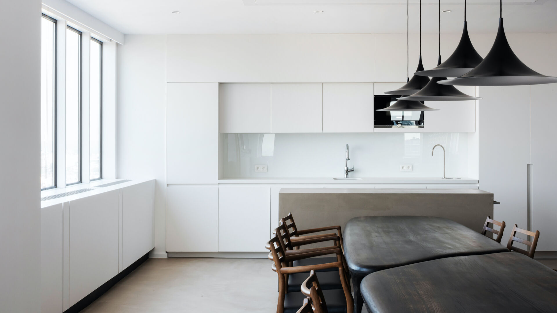
Combining a strong blue with creamy or white shades results in a more classy appearance with the light-dark contrast you are creating. And although the difference in colour is small we can recommend combining dark blue with black. Since black is one of the most popular colours for kitchen appliances and equipment, this can create quite an exciting look in the kitchen. From toaster to kettle, blender to tea machine: the Avoury One in pure black makes for the ultimate eye-catching look when offset against a classic blue stripe on the wall. Harmonious colour combinations are a safe route to go for those who prefer a cautious approach if you want such a colour combination, combine shades that are close together on the colourpalette - this creates smooth, balanced colour transitions.
Whether a turquoise blue combined with petrol, a voluminous yellow alongside a pastel yellow or a dark bottle green alternating with olive shades: the possibilities are virtually limitless. Interior design is a particufarly good area for demonstrating how versatile the character of colours is - the effects on the viewer seem endless. You won’t regret experimenting with it!
Experiment with colours - be it with your Avoury One which comes in 3 different designs of colours or with your tea that can be chosen from more than 30 variations
More articles
More articles
Not less, but better.
Sharpening one's own awareness. Recognizing what one really needs. Giving things new appreciation. That's what minimalism is about. Following the motto 'less is more', more and more people are embracing the desire for clarity and order – even in the design of their homes.

Should we always follow our nose?
23,000 times – that´s how many breaths we take on average per day. And that means a multitude off different scents float in through our nose evoking a wide variety of reactions in us. In this article we´ll explain the psychological reasons behind this and why we should let our noses discover new things more often.